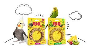
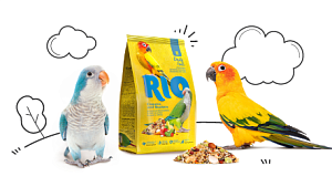
Mealberry Group started 2019 by launching RIO product range in a new design. Company’s experts have many years of experience working closely with breeders, vets and consumers, which gave a powerful boost towards a reboot of the RIO brand.
The brand’s main characters are birds: bright, agile, dynamic, each with its own unique personality that fully reflects the new brand slogan: Here, there, and everywhere!
New packaging design has become an effective tool of communication. It is exciting to pore over the details of each pack.
What has changed:
- New brand logo is now a central element of design.
- Yellow is the main range colour and brand identifier. It will visually set RIO brand against other products on the shelf and will help consumers to find it.
- There are colour markers on every package: unique labels marking product type.
- It is now easy to find out more about product advantages thanks to user-friendly infographics.
- New design also includes integrated recommendations for product use.
We have put a lot of work into exploring the character of the brand and developing the tools to help consumers to get to know the product on the pet shop shelf and make it easier for them to find their pets’ favourite foods, treats, vitamins&supplements, and care products. An important feature of the project is the fact that product compositions, production technologies, and prices have remained the same.
RIO: for your colourful, agile and beloved feathered friends!